
TL;DR
In another article, we discussed the case for a simple maths model within a bowtie diagram. Here, we take a more detailed approach to how that works in Bowtie Designer v1.
Keeping the emphasis on comparative data helps us to decide where to focus efforts. It’s an approach accepted throughout risk management. Without trying to calculate the absolute probability of an event, numbers help us to draw useful comparisons.
What is a bowtie diagram?
A Bowtie diagram illustrates—visually—the potential causes and effects of a single high-impact event. This “Top Event” usually means loss of control of a major hazard. It also shows controls that should be in place to prevent the event, or its potentially bad outcomes, from happening.

Trigger Events
On the left-hand side of the bowtie diagram are triggers, that is potential events leading to loss of control of the hazard. Any one of these triggers must have potential to cause loss of control of the hazard, and in that sense alone they are all the same. But compare the act of filling a tank every few days (with the risk of over-filling) with annual maintenance on the same tank (also risking loss of containment). The filling operation occurs roughly 100 times as often as the other event, and this deserves recognition.
Focus point 1: Bowtie diagrams represent multiple possible causes of loss of control. Some of them occur more often than others.
Bowtie Designer accounts for this difference with a frequency scale against the trigger, and a range of six levels. The numbers we associate with these levels vary from -6 (“Almost Never” with an implied value of 1 x 10⁻⁶ i.e. 1/1,000,000) to 0 (“Constant”, which implies 1, or a million times more often). It is a relative scale which you are free to use (or not).

Preventative Controls
In a Bowtie Diagram, preventative controls represent barriers which should stop a trigger from leading to the loss of control event. Each should work independently of the others, but should be able on its own to be effective, even if all the others fail for any reason.
If this were truly possible, then only one control would be needed. However, as is obvious, controls do fail. An alarm may break, a person may be distracted, or paint will flake. Bowtie Diagrams consider these as degraded states of control and we will take a more detailed look at these “Escalations” further down.
Focus point 2: Every control in a bowtie diagram should independently be able to prevent a loss of control, but in the real world they may not be 100% reliable.
In the meantime, Bowtie Designer provides a simple method of assessing the Dependability or Effectiveness of a control using a simple scale. This supports the “Current Condition” approach, as recommended by The Energy Institute and the Center for Chemical Process Safety.

Diagrammatically, these values are colour-coded from red (value 0 or “not working”) to green (value -3 or “very good”).
If we add these values to the base Trigger Frequency, it provides a heuristic for the combined effectiveness of controls, which is mainly a visual indicator at this stage.
In the example above, we’ve added -3, -1 and 0 to the trigger frequency (also zero) with the resulting sum -4 (in the logarithmic sense, that means 1 x 10⁻⁴, a really big reduction). This combined value is indicated by the yellow shield on the trigger symbol. The calculation is shown in the pop-out side panel, which provides further details about the trigger.

The next version of Bowtie Designer (1.1) will add an alternative non-logarithmic scoring method for controls, in which you choose values between 1 (no effect) and 9 (for a nine-fold reduction), representing the effectiveness of controls. For when you are taking a more conservative view of risk reduction, this linear scale allows you to use smaller numbers.
Rolling up the numbers
When a number of triggers and controls are arranged in this way, they all contribute independently to the total risk.
Take the example bowtie diagram below, which has five separate triggers and 15 controls:

Sum the numeric value of each trigger and its associated controls to indicate a quasi-probability P(n), or what could be termed an “objective score”.
1 x 10⁻⁶
1 x 10⁻⁵
1 x 10⁻⁸
1 x 10⁻⁸
1 x 10⁻⁶ +
1 x 10-4.9
This single objective score represents the whole left hand side. Be aware that the effect of orders of magnitude means some triggers hardly influence the total score. Taken on its own, the single objective score means very little. However, it could be used to compare two different but similar sites or a trend on one site over time. It is also a basis for another method, sensitivity analysis.
Focus point 3: Without assigning too much meaning to them, numerical values can help focus on areas of weakness in a bowtie diagram.
Sensitivity analysis
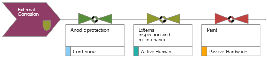
As we build the bowtie diagram, patterns begin to emerge. Firstly, as shown below, “External Corrosion” appears to be less well controlled than “Internal Corrosion”. That’s worth investigating on its own.
Secondly, “Anodic protection” figures as a barrier control twice, affecting both triggers. It is currently rated as “Very good” (-3) which cannot be improved upon, but any deterioration in that rating would affect both separate triggers and so have a magnified effect.

Focus point 4: The same control often appears more than once in a Bowtie diagram. Sensitivity analysis helps to identify heavy reliance on specific controls.
This is a useful basis for sensitivity analysis. You can intuit the importance of the control visually, from the number of appearances in the diagram, or analyse it more thoroughly from the output report.
Escalations
We also promised to discuss Escalations. Visually and analytically, these are used to separate control deterioration factors from the controls themselves. It’s very common to see Bowtie Diagrams where measures to prevent deterioration are presented as barrier controls themselves. This complicates the diagram and confuses the true meaning of a barrier. For example, taking an Interlock as a barrier control, then lack or maintenance and testing, or a badly-designed design change might affect its functioning. Maintenance, Condition Monitoring or Management of Change in and of themselves are not barriers in this example. If we add them as barriers, then the bowtie diagram becomes bloated and confused.
Focus point 5: Make sure that Bowtie Diagram controls really are controls, and describe “escalations” separately in order to keep your analysis clean and tight.
Here’s an example taken from a UK Civil Aviation Authority bowtie diagram for “Loss of control of large fixed-wing aircraft”
The trigger scenario is “Flight Crew mishandling of manual flight path…”. Its first control “Flight Crew proficiency in manual handling skills…” has been rated as a “Very Good” control (value -3). The Escalation (deterioration factor) associated with this is “Lack of exposure to the required manoeuvres during normal line flying operations.” We treat an escalation as nullifying the value of the control until at least one remedial Escalation Control has been introduced.
In this case there are two Escalation Controls:
- Aircraft Operator’s simulator program includes manual handling exercises to ensure proficiency
- Automation policy encourages manual handling at appropriate times

Each of these Escalation Controls has been rated Good (-2), which is visually represented by the coloured arrow on the left, and in the side panel information for the barrier control.
Right-hand side impacts
We haven’t covered the right-hand side of the Bowtie Diagram in this article, but there is an equivalent approach which we touched upon elsewhere. We’ll write more about it in due course.
What are key learning points?
- Bowtie diagrams represent multiple possible causes of loss of control. Some of them occur more often than others.
- Every control in a bowtie diagram should independently be able to prevent a loss of control, but in the real world they may not be 100% reliable.
- Without assigning too much meaning to them, numerical values can help focus on areas of weakness in a bowtie diagram.
- The same control often appears more than once in a Bowtie diagram. Sensitivity analysis helps to identify heavy reliance on specific controls.
- Ensure that Bowtie Diagram controls really are controls, and describe “escalations” separately in order to keep your analysis clean and tight.
What do numeric values give us?
A bowtie diagram is a visual representation of risk management arrangements. As such, rating the value of controls is an entirely optional refinement. But it is one that helps to highlight weakness in the arrangements as they stand in the real world, even though they may be based on intuition rather than data.
In a well-organised bowtie diagram, where barrier controls are truly what they say, the addition of numeric scores can also help to focus on sensitivity to controls which are heavily used in multiple places.
Picture credit: Francis Scott Key Bridge and Cargo Ship Dali NTSB 2024 from Wikimedia Commons