
A bowtie diagram illustrates the risks that arise from a hazard, with a view to managing and reducing the risk. The diagram focuses on a single scenario of a severe incident related to the hazard, and gathers together its many possible causes and effects in a single view.
Because the bowtie diagram shows multiple possible causes focused on a single incident or event, and then an expansion to include the potential consequences, the constriction resembles a bow-tie, and so the name is a clue to its appearance.

Why use bowtie diagrams?
Typically the single severe event of interest is a ‘loss of control’ scenario. For example you may consider headline events such as an escape of a hazardous material or a critical process becoming unstable. That could result in an escape of explosive or toxic chemicals (loss of containment), a transport incident, or the collapse of a public service. All of these could result in harmful events. What justifies this kind of analysis – at the detail level of a bowtie diagram – is that their severity makes managing the risk worthwhile.
The common approach to risk management begins with identifying critical risks and then:
- Avoiding them altogether, or
- Reducing them and
- Mitigating the possible bad outcomes
The bowtie diagram is a good visual tool for overseeing a range of risk reduction and mitigation controls, because it represents controls (sometimes named barriers) directly in relation to each cause and effect. Also, apart from the visual aspect, the diagram can help establish the beginnings of a statistical model. This, in turn, can underpin the ranking of critical risks and help to prioritise the effort spent on them.
Who uses bowtie diagrams?
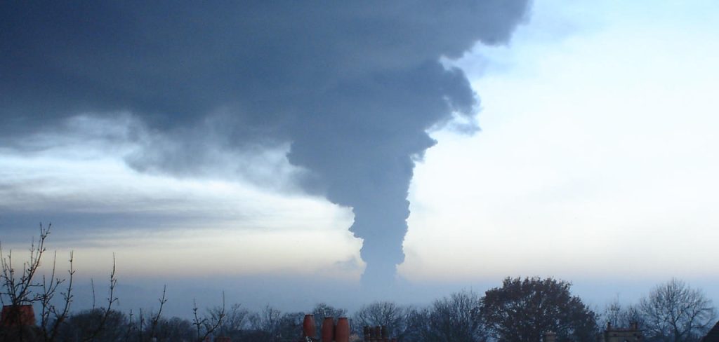
Bowtie analysis, or the ‘bowtie method’ evolved from a variety of methods such as fault tree and event tree analysis and causal factor charting, which found early use in the nuclear and aviation industries. A major chemical disaster at Flixborough in 1974 led to the introduction of the Health and Safety at Work etc Act and later to COMAH regulations in the UK and the Seveso Directive in the EU, applied widely to chemical and petrochemical processes and storage as well as the nuclear industry. Then the Piper Alpha disaster (1988) was a major spur to the oil and gas industry to develop its approach to major hazards further, with the earliest standardised approach being defined by Shell.

Since the bowtie method became an established method of risk management in these industries, it has expanded to applications in mining, electricity generation, rail and maritime transport, healthcare and the water supply industries. It has even been applied in cyber security and financial modelling.
Where do I begin?
If your business brings people – either staff or the public – into contact with hazards, then begin by considering which of them have the greatest potential to cause harm, damage, or adverse health effects. Consider environmental damage as well.
Let’s use, for example, a zoo which keeps tigers or other apex predators. A tiger, of course, fits the definition of a hazard, but when properly managed it is not a high risk. And that is the point. Although a hazard lies at the heart of every bowtie diagram, it only has potential for ham and the actual risk of harm is a question of management.

It requires a chain of factors for the hazard to become the cause of harm. So consider loss of control scenarios. As mentioned above, these could include an escape of a toxic, explosive or otherwise dangerous substance, or loss of a system upon which people depend. Of all the potential loss of control scenarios, pick one as the Top Event. This event only represents loss of control, nothing bad has happened yet, but the potential for harm has been unleashed.
In our example, let’s consider ‘loss of control’ to mean the tiger has escaped its pen. Your bowtie diagram now has its two central elements – the Hazard and the Top Event.

And then the outcomes…
As we are still establishing the potential for harm, it makes sense to consider the right-hand side of the bowtie diagram first. That concerns the possible bad outcomes (or consequences) of loss of control. List these out and then refine them. Each will form a separate branch on the right of the diagram. It makes sense to be specific about these outcomes, so ‘fatalities’ may be a worst-case scenario but be clear about the mechanism whereby your hazard might causes fatalities. This is because it may still be possible to mitigate the effects loss of control. For example, an evacuation drill. Another example: separating high-risk areas from where people are working as much as possible.
These mitigation controls (or measures, or barriers if you prefer) should be added to your bowtie diagram. Some of them may be valid approaches to mitigating several outcomes.
In our example bowtie diagram, fatalities may be the obvious concern, but being mauled or eaten by an escaped tiger isn’t the only reason they may occur. A crush of people trying to get away might also be a possibility. The bowtie diagram should separate these outcomes, because the mitigation controls should be different.

One final thing, as risk managers may already be thinking, rank the outcomes in terms of severity (impact). Arrange your bowtie diagram with these at the top (or coloured to highlight). Because some outcomes will be worse than others, as shown on the classic risk matrix, which plots impact against likelihood. Again, this is a key aspect of prioritisation.
Later, you may want to consider the effectiveness of your mitigation controls as the ‘y’ axis of the risk matrix. First, let’s consider the causes of loss of control.
Causes (triggers) leading to loss of control
The left-hand side of your bowtie diagram considers the triggers that may lead to loss of control of your hazard. Just as you did for outcomes, list out the possible trigger events.
The broad categories of trigger may be things like inadequate design, or equipment ageing, or operating equipment outside its design parameters. Equipment may also be expected to fail from time to time, it is simply a question of how often it is used. Alternatively, extreme environmental factors may apply. Other factors may include deliberate interference (sabotage, terrorism or other crime). Each of these may trigger a loss of control event and should be factored into the risk.
For the sake of our example bowtie diagram, suppose that the keeper enters the tigers’ pen and leaves a gate open, allowing a tiger to escape. Surely that would never be allowed to happen, we immediately think. And that is because we instinctively expect to control such blatant risks. (Incidentally, would you treat that as a human factor failure rather than a design failure?)
Would the zoo not have installed a double gate? And to ensure no direct access between the tiger pens and public spaces? And so, you have begun to map the controls (literally, barriers) which reduce the chances that the trigger event leads to the loss of control scenario. This is what the bowtie diagram is especially good for.

From the perspective of ranking trigger events, it is also worth considering how often they occur. Force 12 hurricanes may blow down a fence, but they happen more rarely than the number of times that a keeper goes in or out of a pen.
When controls don’t work
Have you now completed your bowtie diagram? Have you have listed the triggers, the controls (barriers) designed to prevent those triggers from leading to the top event? And have you have listed the possible outcomes and the mitigations designed to alleviate the potential impacts of the top event.
Let’s assume that you have. And yet, sometimes bad things can still happen.
That’s partly because the controls aren’t perfect and sometimes they may not work at all. Here is one of the uniquely powerful features of the bowtie method. They are generally called ‘escalations’ and they represent reasons why controls fail. That’s closely related to causal event analysis.
For example, an alarm which fails, or one which goes off too often and is ignored. Or (in our scenario) a double gate which lacks a functional interlock and therefore allows the possibility of both gates being left open.
For this reason, in a well-designed risk management scheme, you would not rely on a single control. But again, what if all your controls rely on a maintenance regime which has become degraded, or an assumption about staff competence that does not always apply? These are the kind of situations that the bowtie supports, where multiple controls can fail (the ‘Swiss Cheese’ model of accident causation).

The Bowtie diagram also helps to highlight and manage these causal factors through the addition not only of Escalations (the degrading factors), but also Escalation Controls, that is measures to manage Escalations and prevent them from degrading the effectiveness of controls.

It is fair to say that when all these elements have been added to your original bowtie diagram, it may no longer resemble a bowtie. Not only that, but some of the original readability may have been lost. This is one of the challenges of bowtie analysis, and one reason why you want to reach for a software diagramming solution which offers the following benefits:
- Easy to draw
- Easy to show greater or less detail
- Easy to highlight re-use of controls (barriers)
- Easy to search for key text
- Easy to add extra detail (descriptions, links, or other meta data)
- Easy to share
- Easy to export the model for reporting purposes
These, alongside “easy to try”, were the key design factors underlying Bowtie Designer, a free app for modern SharePoint®. There are some ‘premium’ features, for which you can purchase a licence, but you can get a good feel for the bowtie method and sketch out your basic diagrams in the software which is downloadable for free from the Microsoft Marketplace.
Further resources:
Picture credits:
- Flixborough photograph from Scunthorpe Evening Telegraph
- Buncefield photograph from Anna Debenham
- Tiger pictured by Quinta La Fauna Zoo